I have compared the codes and conventions used in my digi pack ancillary task to existing digi packs:
Front Cover

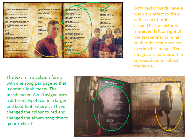
Tray Card

Interior
I have compared my main task to existing music videos:
Here we have used this finishing shot of the stool alone in a vast isolated area.Within this shot the stool resembles Tom being so alone. The use of a vast surrounding is effective as he still feels so alone. Both shots have dim low key lighting to create a mellow mood, the main spotlight in both shots helps to create the reflection of the stool.

Ed Sheerans 'A Team' uses a black and white effect throughout the whole of his music video. I have incorporated this into my music video in scenes wherein we are upset and departed from one another. The black and white creates a sad effect and brings out emotion in the audience.

Ben Howards 'keep your head up' displays a shot of the sun catching the camera creating a piercing glare, this effectively took place in our video. This sun reflects the happy mood of the characters as they are together, this is an example of pathetic fallacy through camera shots.

This is a camera shot from Two Door Cinema Club's music video to 'Handshake.' Our music video has included many close ups of the guitar strings being plucked. This is an example of a different angle shot, filming down the spine of the guitar so you can really feel like you're in the music.The use of their faces being cut off means that the music speaks for itself, the zoom on the fingers playing the guitar portrays mystery.

This is an example of a birds eye view look of a city from Adeles 'Make You Feel My Love', ours is the view of London. The use of this shot shows how big the world is yet how alone you can still feel.This shot also creates iconography for the audience for it is the view from the shard. The lighting within this picture is very glum and moody which reflects the emotions of both the characters. The use of this Birdseye view shows how they are both out there somewhere in the big world but can't be with each other.

Taylor Swifts 'We Are Never Getting Back Together' displays a shot behind the actors following them, Taylor is walking through a love heart and me and Kieran are walking through a tunnel, both of witch are romantic settings. From the back of the actors you can see the chemistry through holding hands, hugging and play fighting. Effectively there is light at the end of our tunnel which shows that there is hope, in Taylors video there is an ongoing forest showing that they will forever be on a journey with each other.

I have also compared the codes and conventions used within my album release magazine advert to an existing advert:

No comments:
Post a Comment