Tuesday 30 April 2013

Digi Pack Development Draft 4

Below is the final draft for my digi pack before making final adjustments. I completley changed the background to the same as my album release poster so it comes together as one promotional package. I also changed the effect on the pictures so that they dont blend in with the background and match the old fashion/worn out effect. Following this I also changed the bands name style to match what is on my album poster and to make it more appealing and more professional.

Draft 4


Shannon: Changing the background has made your work look much more professional and neat. The images look much better and match the worn ou theme. The image of the rose looks effortless and repeated, getting in as many shots as you can would be much better and effective.

Kieran: The text is yet to be all lined up as it currently looks messy and when printing it out half of it will be cut off. There is also a blank page which needs to be filled in by either another shot or another song.

Harry: The front cover looks much more professional now the bands name has been changed, however the name of the album 'Hey There Delilah' blends in with the background too much eventhough you have drop shadowed it.

Monday 29 April 2013

Digi Pack Development Draft 3

Below is my 3rd draft for my digi pack ancillary drafts, I took into consideration the criticism I was given and made improvements to my work. I changed the colour and style of the text so that you could differentiate the song lyrics to the song titles. I also included love hearts as a back drop on to the background to reflect the romantic genre of the album and to match the logo. I gave my work to the same three students agin to evaluate and help me make final improvements.

Draft 3


Shannon: The red glow effect on the images makes them look unprofessional and childish , it also clashes with the background colour. The images need to be slightly darker and match the old, warn out effect that the rest of your groups looks like. The background itself, no longer matches your final album release poster which therefore doesnt make it look like on promotional package.

Kieran: Although it is effective that you have included elements of genre through toned down love hearts, it looks too messy and makes it hard to read the text. However changing the text to 'Prestige' makes it look more professional bu the subtitles should be in 'poor richard' as that is your known font throughout the promotional package./

Harry: The front cover looks much more professional and attractive to an audience, including the bands logo is important as it helps you to identify the band. Incorporating the red rose is effective as it matches the genre and is used throughout your whole groups work however your front cover looks like everyone elses, it needs to look more individual.

Digi Pack Development Draft 2

Below is my second digi pack development, I have now included edited images with a red outer glow to match the red and black colour scheme. I have also now changed the colour of the background in order for it to match my album poster so far.

Draft 2


Shannon: The solo shots are very effective as they are all clear and making eye contact with the audience, however they blend in with the background too much.

Kieran: The song lyrics need to be differentiated from the song title, this could be done by using a different type face or colour.

Harry: The pages are rather bland and don't stand out very well or represent the genre, try incorporating elements of the genre and the same fonts that are on the album release poster to create a consistent promotional package.

Digi Pack Development Draft 1

Below are my first development drafts of my digi pack. I asked my class members for constructive criticism in order to improve my work.


Draft 1


Shannon:The colour and effect on the background doesn't match your album release poster which makes them look completely contrasting.

Kieran: There needs to be band shots and solo shots in order for it to be attractive and appeal to an audience through graphics and gaze theory.

Harry: The front cover of the digi pack is dull and doesn't represent the band or the genre, you also need to include the bands logo.

Album Release Poster Development Draft 3

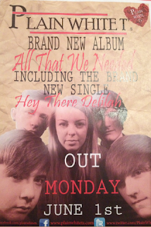
This is another development draft showing that my work is increasingly becoming more attractive and effective, these are the final comments I received before making final adjustments to my final album poster. I have included a rating, changed the image and the background as well as the type face for 'out monday.'

Draft 3


Shannon: Including the ratings is effective however the alternative black and red colours have been stopped which makes it less consistent and more messy.

Kieran: Using The New York Times as the rater is relevent to the band as they are american. Also including a real newspaper makes the poster more realistic.

Harry: The logo for is too far over the Band masthead, a slight adjust to the left would use up more space and make it look less overlapped. Aswell as this there is blank space under 'Hey There Delilah,' you should move it up and make the picture bigger.

Friday 26 April 2013

Album Release Poster Development Draft 2

This is my second development draft for my promotion of an album poster. I have changed the colour of the background and included more text as well as making a band logo that is effective and looks more professional. Once again I have asked for feedback to make improvements   

Draft 2

Shannon:The colour of the back ground now matches the groups work and makes it all come together well however it looks rather tacky, you should look for a more worn out effect as a background.

Kieran: Bringing in the song that you created the video for is good as it adds to it being a promotional package. Including the exact date that it is released looks slightly messy and is taking up too much room on the picture. Their is still too many different fonts being used and they are also layering over the image too much.

Harry: The picture you have used is good because their is eye connection with the audience however it blends in with the background too much. As well as this, the url's are hard to read, a brighter colour needs to be used.

More Editing

As the deadline gets closer, we have made further improvements on our music video and have videoed more footage. There are still a few blank spaces which need to be filled. We went out and took more footage that would be effective in filling these blanks such as abstract shots of wildlife, footage of writing the lyrics and filming Delilah crying on her own by a tree. We have removed some bad band shots that didn't include enough movement and levels and replaced them with more effective shots. We also split up some footage that was too long, still using it however going back to it later on in the music video. Throughout the music video we have stuck to black and white on the narrative when they are apart from each other and colour for band shots and when they are together.

Below is half of our music video so far:


Album Release Poster Development Draft 1

Below are my development drafts for my album promotion poster, I asked a few students to evaluate my work and give me some constructive feedback in which I could take on board in order to improve my work.

Draft 1


Shannon: There are too many fonts being used that your work looks messy and confusing. The logo is also slightly too big and would look better in the corner. More text needs to be included in order to lure an audience in and advertise it better.

Kieran: The use of crumpled tissue effect as the background is effective however it doesn't follow the same colour as the rest of your groups ancillary tasks.

Harry: The use of a red and black colour scheme is effective as it creates consistency however the use of two different colours on the band font makes it look messy. It also rather effortless and needs to look more professional.

Editing Our Music Video

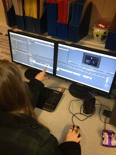
We have taken enough footage to be able to start the editing process of our music video. We have downloaded 'Hey There Delilah' and as a team have been editing in our free periods and during practical lessons. Below is a video of our music video so far.


Thursday 25 April 2013

Reception Theory

Reception theory is based on the idea that no text has one single meaning rather the meaning is produced as a result of interaction between the audience and the text. Reception theorists suggest factors such as gender, social status, and social context are every important when we construct a meaning for a text. In 1980 David Morley undertook a study based on different peoples reception of the television programme nationwide. He discovered 3 main types of reading:

Dominant (hegemonic) reading- reader shares the programmes code and accepts the preferred reading.

Negotiated Reading- the reader partly shares the programmes code but modifies it in a way which reflects their position and interests.

Oppositional reading- the reader does not share the programmes code and rejects the preferred reading bringing to bear an alternative frame of interpretation.

In my opinion the preferred reading for our music video is 'negotiated reading' as the genre is love, with themes of separation  heart ache, being in love and having what you can't have. These are all things that everyone goes through at some point in there life, even if they aren't going through it right now, when watching the video they will put themselves in either tom or Delilahs shoes and change it to their current circumstances. Love is such a big genre that even if the audience isn't in love with someone and isn't going through separation they could relate it to what could happen in the future or think of someone else who has gone through this that they are aware of. However it is said that different factors of a person determine how they will react to the music video, for example a male watching this video may find it too cringey and soppy and not being about to relate with 'Tom' because this is the facade they put up to protect their manhood. The age of actors as well determine who the audience are, for if the music video contained actors 50+ it would more appeal to the older generation as the younger generation wouldn't be able to relate to their relationship. Following this however a young audience member may not be able to relate to this video as love, long distance, heart ache etc are things they have not yet been introduced to as they are too young to understand and connect with the text. Because it is aimed at those 15+ you would still think that the older generation would not be as interested however it could remind them of back in the day when they were young and in love and going through all the things a teenager/adult has to. Those who are going through the same issues as expressed in the video would immediately be able to relate to it and hopefully reinforce emotion into them thinking about good times they had and knowing that they are not alone and other people (characters in the video) are going through the same issues. Some people however listen to music to match their mood or to make them feel even more down than they all ready are, for instance if you're upset some people try and cheer themselves up by listening to their favourite song or something upbeat to take their mind of things. Or contrasting to this some people like to listen to something matching their mood, to bring out emotion in them, such as listening to a sad song when you're upset makes you cry even more and makes you feel worse but you just can't stop yourself from listening to it.

Thursday 11 April 2013

Introduction Editing

An idea I came up with for the introduction of our music video was to have scrabble stop motion reading out 'Hey There Delilah' by 'Plain White T's' this is a common piece of footage normally found in music videos or the beginning titles in films. Kieran offered to to do this piece of footage, so he took home a hand held camera and a tri-pod, chose a plain surface that would help the letters to stand out and took 66 individual shots. We thought that there should be a red item present to follow the red motif theme, so we chose a red pen and a piece of paper which linked in with the game of scrabble. Each shot was taken individually, moving the scrabble pieces separately and very slightly each time so that it flowed and didn't jump too much. As a group we then edited this on adobe premier pro so that it fits in time with the music and flows nicely spelling out 'Hey There Delilah' and ' Plain White T's.'

First Shot
This was the very first shot, it shows the paper and pen to the right of the screen so that it doesn't take the attention away from the titles. A few scrabble pieces are present aswell to show what is about to happen and so it can start straight away.


Mid Shot
There are many shots before this shot comes in however this particular one shows the scrabble letters getting closer and are all tilted to show the movement taking place.


Final Shot
This is the final shot in the stop motion, these words are spelt out just before the lyrics come in, it acts as a queue. A problem that occurred during this process was that there weren't enough 'H's' so blank scrabble tiles were used to replace this as it is still evident as to what it spells out.


Below are all 66 individual shots that were taking during the scrabble stop motion process: