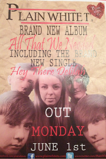
This is my second development draft for my promotion of an album poster. I have changed the colour of the background and included more text as well as making a band logo that is effective and looks more professional. Once again I have asked for feedback to make improvements
Draft 2
Shannon:The colour of the back ground now matches the groups work and makes it all come together well however it looks rather tacky, you should look for a more worn out effect as a background.
Kieran: Bringing in the song that you created the video for is good as it adds to it being a promotional package. Including the exact date that it is released looks slightly messy and is taking up too much room on the picture. Their is still too many different fonts being used and they are also layering over the image too much.
Harry: The picture you have used is good because their is eye connection with the audience however it blends in with the background too much. As well as this, the url's are hard to read, a brighter colour needs to be used.

No comments:
Post a Comment