I created an album release advert, a digi pack and a music video, all in which shared the same conventions for it to come together as one promotional package.I wanted the audience to be able to look at each of my tasks and be able to relate them to the same band through the genre, style, typeface, logo etc all of which are small yet vital elements which identify them as one.
Codes and Conventions that were followed throughout my ancillary tasks are:
- Typeface for band name,advertisement and album name-poor richard
- Typeface for lyrics/advertisement- prestige
- Fearless Records Logo
- Barcode
- Effects on images
- Using the same people
- Background
- Colour scheme-black,red,white,brown
- Band logo
- Rose
It is clear that my ancillary tasks are linked and related to our music video as we have included:
- Same Actors
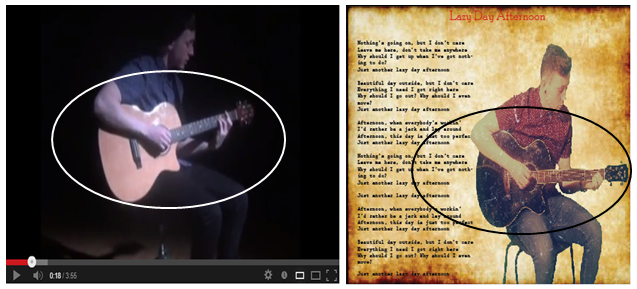
- Same Guitar
- Red motif
- Black and white effect
- Mise en scene
- Paper shots
- Serious and happy shots
- Band Name
Here the same guitar has been used within both tasks to show that they are part of the same package and to reflect the genre of indie pop.The guitar in the digi pack however is a different colour as it has been edited.
Here we have used the same actors in the band shots for the digi pack and album release poster as we have in the music video. We did this so that the main band member also played the main character in the narrative and the only girl in the band played the main girl in the narrative therefore it all links up.
Here we have followed the black, red, white and brown colour scheme. We have also followed through the use of a red motif, in the video the pen is the motif and on the digi pack the bands logo is the red motif. Here you can also see that the same band name has been used, simple yet identifies them as one.
Here you can see on our digi packs that we have used a worn out paper as our background, within our music video we have shots of lyric writing on paper this is just like the lyrics being displayed onto the worn out paper on our digi pack,
Here we have used a variety of shots portraying different emotions. Within our digi pack we posed with serious and happy faces to portray our characters and give it a slightly warm vibe. Within our music video we have happy shots when Delilah and Tom are together and sad shots when they are departed.
Uses and gratification theory is portrayed throughout our ancillary tasks, within the narrative escapism is shown by emphasizing the journey between the two characters to the point where the audience see it as reality as they are so drawn in and become the character themselves. The audience may escape into new emotions and situations just through watching and listening to the song.
Personal relationships are applied within the narrative through footage such as flashbacks, chemistry between the characters (hugging, kissing, smiling,holding hands) and locations. This is also appliedwithin our ancillarys through the song lyrics, red colour scheme and the red heart of roses as the logo. For the smallest thing could create emotion for the audience member as they could be reminded of a specific time in their life.
Personal identity is shown throughout our ancillary tasks and the main task of creating a music video as the genre is indie pop therefore attracting two different social groups. The age of the band members, actors are perceived as 19-21s, luring in an audience possibly 15+. The theme of love and romance is what implies this target audience as teenagers become emotionally involved and attached in relationships creating personal identity.There are both male and female band members which means both sex audiences could relate to our music video.


No comments:
Post a Comment